


- Name
- {{_record.bsp.name}}
- Postcode
- {{_postcode}}
- Substation Type
{{_record.bsp.bspType.displayName}}
- Number of connected primaries
- {{_record.bsp.primaries.length}}
We've created a map of the National Grid area that displays the carbon intensity for every substation, to give an overview of generation resources and how each substation compares to others in our area. Click on an area to view a summary of types of generation for that substation, and how much energy is locally generated.
You can control what is displayed on the map using the control fields above it. For the carbon intensity, you can set a date and time (within the range of our records or forecast) to see how the carbon intensity changes. The map can also be used to show other information for the substation, such as its assessed type (urban, rural etc. which helps understand what is likely to be possible in the way of local generation) and the overall level of renewables which are connected to it (measured by installed capacity, a theoretical maximum figure).
If you would like to know more about how we generate the information below, take a look at our FAQs. We also have a number of online Videos and Guides which tell you more about what we do in the community energy and network innovation areas. These are available here. To find out more about what we do as a Company please view some of our videos in our video library.
When local energy is generated at its maximum capacity, how much of this substation's energy is locally powered and how much is sourced from the national grid?
When the conditions are perfect for locally generated energy to reach maximum capacity, what is the split between local renewable and non-renewable generation?
If not simply navigate the map and move the pin to the correct area or try entering a postcode again.
We use the data from our energy distribution network to calculate local energy mixes to generate results within this area.
We are unable to provide a local energy analysis for your location, as the data for this location is incomplete.
This usually happens when the electricity is supplied by another Network Operator, even though it is within the National Grid area.
Unfortunately we can't show the carbon intensity for the date and time that you have selected. This is probably because a forecast is not available yet, or our historical data does not go back this far.
Created by

National Grid is the company responsible for electricity distribution in the Midlands, South West and Wales. Our business serves over 7.8 million customers and we employ over 6,500 members of staff to ensure the highest quality of service

The Carbon Trust is a not-for-dividend company that helps organisations and companies reduce their carbon emissions and become more resource efficient. Its stated mission is to accelerate the move to a sustainable, low carbon economy.
Built by Enigma Interactive
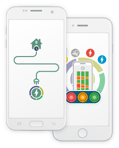
The Carbon Tracer is available on Google Play and the App Store, for Android and Apple devices. Try moving your energy usage based on which hours are greenest or reddest to discover what level of energy efficiency you have!
Update: Please note that we're currently working on adding enhanced substation information to the apps so that they match the website - a new version will be coming soon!
Our app is now available on Google Play and the App Store on Apple Devices